Why build this?
If you want to understand where a suburb sits in its cycle, you need more than a 5-year price chart. You need decades of data showing complete boom/bust cycles, so you can see the pattern and understand what happens after a boom peaks or after a correction bottoms out.
The problem is that this kind of long-term analysis doesn't really exist for everyday buyers. CoreLogic and SQM Research have deep data but charge hundreds per month. The banks publish short-term charts that don't show full cycles. And government data from the NSW Valuer General is public but spread across thousands of files in formats that are painful to work with.
So we built it. We pulled every property sale published by the NSW Valuer General going back to 1990, cleaned it all up, and got it into a database. That gave us about 7.3 million sales records across 2,500+ suburbs and 220,000+ streets.
How the cycle charts work
For each suburb, we calculate an exponential trend line (log-linear regression) through the full history of annual median prices. This captures the suburb's structural growth rate over its entire history. It's the answer to: "if this suburb grew at a steady rate for 35 years, what would that rate be?"
We use an exponential curve rather than a straight line because property prices compound. A straight line would understate early growth and overstate recent growth. The exponential captures the compounding nature of asset prices, the same maths as compound interest.
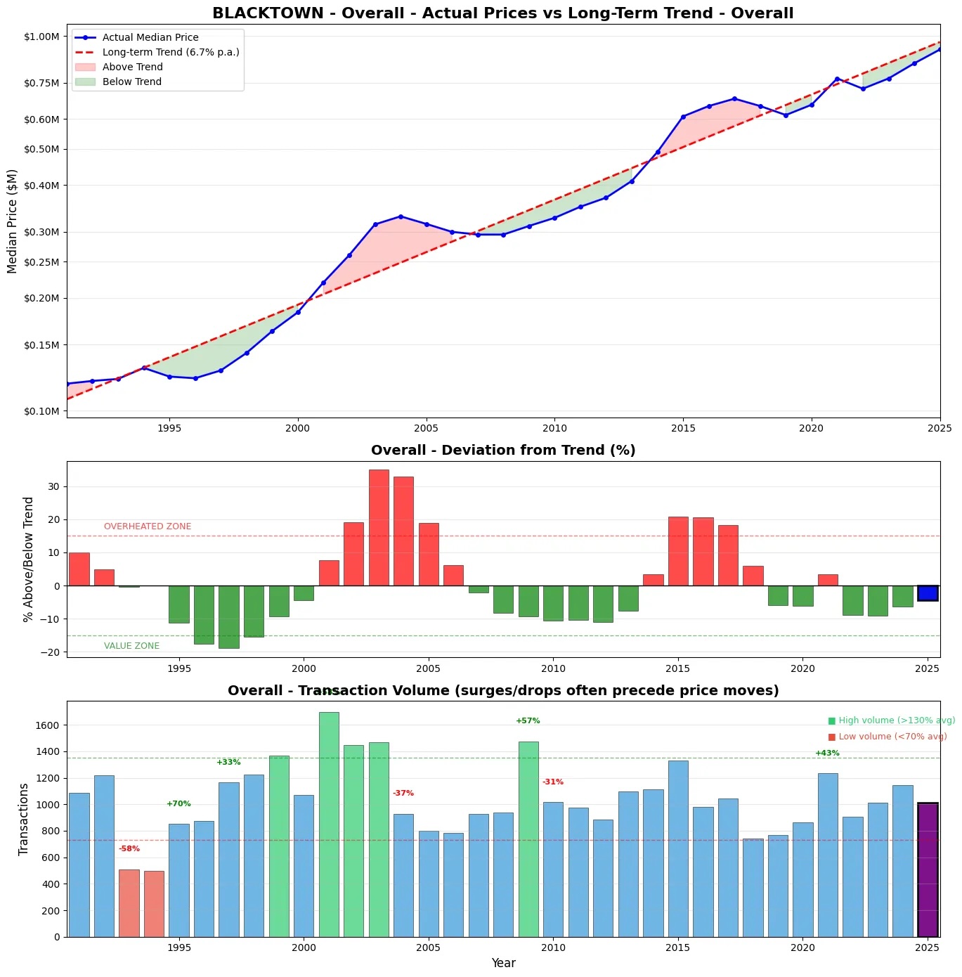
The charts show three panels stacked vertically:
- Top panel: Median price vs the long-term exponential trend line
- Middle panel: Deviation from trend, showing how far above or below the trend the suburb is at any point in time
- Bottom panel: Transaction volume (number of sales per year)
We classify a suburb's current cycle position based on its deviation from trend: more than 10% above trend is overvalued, more than 10% below is undervalued, and anything in between is fair value. The 10% threshold is conservative, filtering out normal noise and only flagging meaningful divergences.
The boom/bust pattern
One of the first things that jumped out from the data was the 2003 boom. Using Blacktown as a case study, prices hit 35% above trend in 2003 and then basically flatlined for nearly a decade. Anyone who bought at that 2003 peak was underwater in real terms until about 2014. That's over a decade of going nowhere while inflation ate into the value of the asset. We explore why credit expansion, not scarcity, was the primary driver in the next article.
The 2015-2017 boom is more recent and more relevant for most buyers today. After that long post-2003 correction, Blacktown swung back above trend during the 2016-17 run, driven by record-low interest rates and strong investor activity. Then APRA tightened lending standards in 2017-18 and prices cooled again. The COVID stimulus pushed prices sharply above trend once more in 2021, before the 2022 rate hikes brought another correction. Currently sitting just below trend for the first time since that COVID peak.
This pattern isn't unique to Blacktown. It repeats across many suburbs. When a suburb overshoots its long-term trend significantly, it tends to correct through a prolonged period of flat or declining real prices rather than a sharp nominal crash. The 2003 correction took about a decade. The post-2017 correction was shorter but sharper due to APRA intervention. Each cycle rhymes, but the drivers and duration vary.
The practical takeaway: buying well above trend has historically meant years of flat or negative real returns. Buying at or below trend tends to be followed by stronger performance. The cycle charts make this visible in a way that a simple price chart never does. But not all suburbs follow the same trajectory. Our analysis of the K-shape divergence shows how inner and outer suburbs are splitting apart.
See the full Blacktown cycle chart → Explore 35 years of price data, trend analysis, street-level breakdowns, and more in the free demo.Volume leads price
The other consistent pattern across the data is that transaction volume seems to spike before prices move. In 2001, there was a big volume jump, then the 2003 price peak. The same thing happened in 2015 before the 2016-17 run.
This makes intuitive sense. When more buyers enter the market, sales volumes increase first. Then the increased competition pushes prices higher. Volume is potentially a leading indicator, something we're continuing to analyse across the full dataset.
What else is in the data
Beyond the cycle charts, the database supports suburb-level analysis across eight dimensions:
- Property Cycle Analysis — median price vs trend, cycle position, deviation, growth rates over 10, 20, and 35+ years
- Price Per Square Metre — houses vs apartments, normalised for property size
- Street Analysis — premium vs discounted streets, ranked by median price and price per sqm
- Street Growth — which streets have had the strongest long-term growth
- Building Analysis — individual apartment buildings ranked by price per sqm
- Densification — streets transitioning from houses to apartments over time
- Flipper Risk — hold periods and quick-flip percentages
- Settlement Risk — problem streets with long settlement delays
Houses and apartments are distinguished using the strata lot number field in the Valuer General data. If a sale has a strata lot number, it's an apartment. If not, it's a house. This lets us generate separate cycle charts, medians, and growth rates for each property type within every suburb.
Look up any NSW suburb → Cycle charts, growth rates, street rankings, and more for 2,500+ suburbs.Community response
The initial analysis was shared on Reddit's Australian property communities in January 2026. The response was unexpected, with hundreds of people asking for charts on their own suburbs. The biggest request was to make the data accessible on a website so anyone could explore it.
That feedback directly led to building AusPropertyInsights.app, which now has the full dataset available for all NSW suburbs. The data is updated weekly from the NSW Valuer General's latest publications.