Think about your parents' house. Maybe they bought it in 1995 for around $150,000, and today it's worth $900,000. But did the house actually get six times better? It's the same three-bedroom brick place, same kitchen, same backyard. If anything, it's older and more worn out than it was back then. So what actually changed?
The standard answer is that there simply aren't enough houses. Too many people, not enough supply. But what if that's not really the story, or at least not the primary cause?
A simple analogy
Imagine you're measuring your height, but the ruler you're using keeps shrinking. On Monday you measure 180cm, and by Tuesday you're suddenly 200cm. You didn't grow 20 centimetres overnight. The centimetres themselves got smaller.
That's essentially what's been happening with house prices. When people say prices went up 600%, what they're really describing is that it now takes six times as many dollars to buy the same house. That could mean the house became six times more valuable. Or it could mean each dollar shrank in value, like those centimetres. The data suggests it's mostly the latter. Our 35-year cycle analysis shows this pattern across thousands of suburbs.
Three things that don't add up
If houses had genuinely become scarce and valuable, we'd expect to see certain patterns. But we don't.
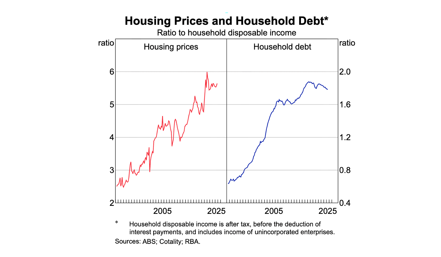
Rent vs price. A $150,000 house in 1995 would have rented for about $200 a week. That same house, now worth $900,000, rents for around $600 a week. The purchase price went up six times, but rent only tripled. Rent is a much better reflection of the actual value of housing as shelter. If houses had truly become scarcer, both figures would move in roughly the same direction.
Price vs income. In 1995, median household income was around $50,000 and the median house price was $150,000, about three years' worth of income. Today, income is roughly $110,000 and the median house price is $900,000, more like eight years' worth. It now takes nearly three times as many years of work to buy the same house.
Household debt. Australian household debt sat at about 60% of annual income in 1990. By 2024 it had reached 180% (Source: RBA Household Sector). We didn't suddenly become three times wealthier. We borrowed three times more.
The maths
Over a long enough time frame, the picture becomes clear: wages doubled over 30 years, borrowing capacity tripled, and together they've driven prices up by 6x.
Why did borrowing capacity triple? The Reserve Bank slashed interest rates dramatically over a long period. In 1990, rates were at 17%. By the end of 2020, they had dropped to 0.10% (Source: RBA Cash Rate). Lower interest rates don't just make individual repayments cheaper. They fundamentally increase how much people can borrow.
In 1995, someone earning $50,000 a year could afford about $1,500 a month in repayments at an 8% interest rate, translating to a maximum loan of roughly $150,000. By 2020, that same household, now earning $110,000, could afford $3,300 a month at a 2% rate, meaning a maximum loan reaching $900,000. Twice the salary, six times the buying power.
When buyers started showing up to auctions with budgets six times larger than a generation ago, prices naturally rose. The houses hadn't changed, but everyone was suddenly holding a lot more money, even if most of it was borrowed.
The gold test
If you measure house prices in gold instead of dollars, the picture looks very different. Gold can't be easily expanded the way currency can, so it's a more stable measuring stick.
A median Sydney house cost 377 ounces of gold in 1995. In 2025 it costs 330 ounces. In gold terms, Sydney house prices have not moved in 30 years. In fact, they fell 12%.
The "growth" most people see when they look at their house price is mostly the dollar losing value, not the house gaining it. We dig deeper into this denominator problem in the next article.
See this in the data → The free Blacktown demo shows how 35 years of price movements compare against the long-term trend.What about supply and immigration?
Population growth is real, and building approvals have been slow in many areas. But if supply constraints were the main thing driving prices up, you'd expect rents to be rising just as fast as purchase prices. They've risen at about half the rate.
Building approvals have increased by 55% in the last 30 years (Source: ABS Building Approvals), more or less in line with population growth over the period. Supply and immigration play their parts, but they are not the primary cause.
What would actually fix it
The most direct fix would be to stop inflating people's borrowing capacity. That means keeping interest rates at more normal levels and tightening lending standards: bigger deposits, stricter income tests. But this would hurt in the short term.
Grants and government schemes that effectively push prices higher should be rethought. The tax advantages that treat housing as an investment vehicle rather than shelter deserve to be removed.
Building more housing is also part of the answer, but only if it's paired with addressing the credit side. More supply combined with unlimited cheap credit just means prices keep rising. More supply combined with tighter credit is what could actually move affordability in a meaningful way. Singapore's approach shows what credit-side reform looks like in practice.
The problem is that almost no one in a position to make these changes has any incentive to do so. The average age of a federal MP is in their mid-50s. Most of them own property. A policy that meaningfully brought house prices down would hit their own balance sheets. And the people who'd benefit most, renters and younger people trying to get in, tend to vote less and have less political sway.
Key discussion points
When this analysis was shared with the broader community, several valuable perspectives emerged that deepened the picture:
Bank deregulation was as important as rate cuts. A former bank officer from the 1980s described how the lending environment changed: "In the mid-80s borrowers needed strict income to repayment capacity, a strong savings record with the bank and a 25% deposit. By the 90s you could borrow up to 90% with mortgage insurance and the banks' calculation of repayment capacity was much looser." The deregulation of the banking sector, not just falling rates, fundamentally expanded how much credit was available.
Parallels with Japan. Observers familiar with Japan's bubble economy (1986-1991) noted the same core dynamic: credit expansion leads to asset price inflation, prices detach from income, and society internalises the belief that "prices only go up," which makes it mentally and financially easier for people to borrow more. The pattern is remarkably similar.
28% of purchases are now without a mortgage. A growing share of property purchases happen without any mortgage at all. This means that interest rate changes have less direct effect on market activity than they once did, and tighter lending rules won't affect that segment of buyers. This is a key driver of the K-shaped divergence we explore later in this series.
The investor dynamic matters. Every major house price spike has lined up with spikes in investor demand, even when rental yields were falling. If investors were buying based on fundamentals, they'd pull back when yields drop. Instead they're banking on capital growth and tax breaks, not actual rental income.
Check where your suburb sits → See whether it's above or below its long-term trend, with growth rates going back 35 years.